Apptio DataLink
Apptio admin users load data to prepare reports for business users. Until now, users had to manually upload their financial data. As this is a very cumbersome and time consuming process for users, they have been asking for connectivity to major financial source systems.
Although Apptio has existing DataLink product to support connectivity to users’ non-financial source systems to Apptio’s, it does not offer intuitive and simple experience that resonates with users.
Therefore, I took this opportunity to redesign end-to-end data ingress experience that meets users’ mental model better. I led design efforts from a very early stage.
Project information
Project duration: July 2019 to April 2020
Role: Design lead
Team: 1 product manager & 7 developers
Tools used: Figma
Interactive prototype
Question
How can we automate data ingress process that is more intuitive and simpler?
How can we show connection status in a more efficient way?
How can we help users make sure that their connections are running successfully?
Problem
Manual uploads are cumbersome and time consuming.
On each single page, there are too many tasks and this overwhelms users.
Users can’t find in product help when needed.
How I got to the problem
1. Current product evaluation
From looking at existing product, I identified user stories which are to set up connection and schedule connection runs. When I assessed usability, the current product didn’t intuitively tell users what to do.
In addition, existing experience focuses on an agent that connects users’ source to Apptio’s. However, I thought that the experience should focus on connection itself. Users come to DataLink thinking they want to take actions based on connections not agents.
2. Customer feedback
Through customer feedback, I learned it’s not only experienced admin users who will be using this, but also novice business users who are unfamiliar with data ingression process.
3. Comparative analysis
I’ve looked at different products such as Turbotax, DataDog and learned how they handle a complex task with simple and intuitive experience.
Goal
Design a data ingress solution with a flow that better resonates with users and provide enough guidance for them.
Users
Primary users are TBMA(Technology Business Management Admin)s.
They set up and monitor connections to make sure all of their data is flowing successfully to Apptio so that they can create reports based on the latest data.
Design process
1. Coming up with user stories
As a user of DataLink, I want to create a connection that uploads data from my source system to Apptio on a regular basis.
As a user of DataLink, I want to make sure that my connection is running successfully.
As a user of DataLink, I want to view and modify my connection.
2. Defining user flows
Based on the stories listed above, I started to think about what are steps users need to take in order to achieve their goals.
This diagram shows a high level flow of data ingress application. I first focused on defining key tasks, and from there, I came up with one question per screen.3. Identify the North Star experience
Based on the flow diagram, I started creating ‘north star experience’ which shows the long term and ideal design with business goals and technical constraints in mind.
4. Iterate designs for short-term version
By definition, the North Star design is not achievable from start, so I started to created short-term versions that effectively address technical feasibility. I created different versions for each milestone.
Solution
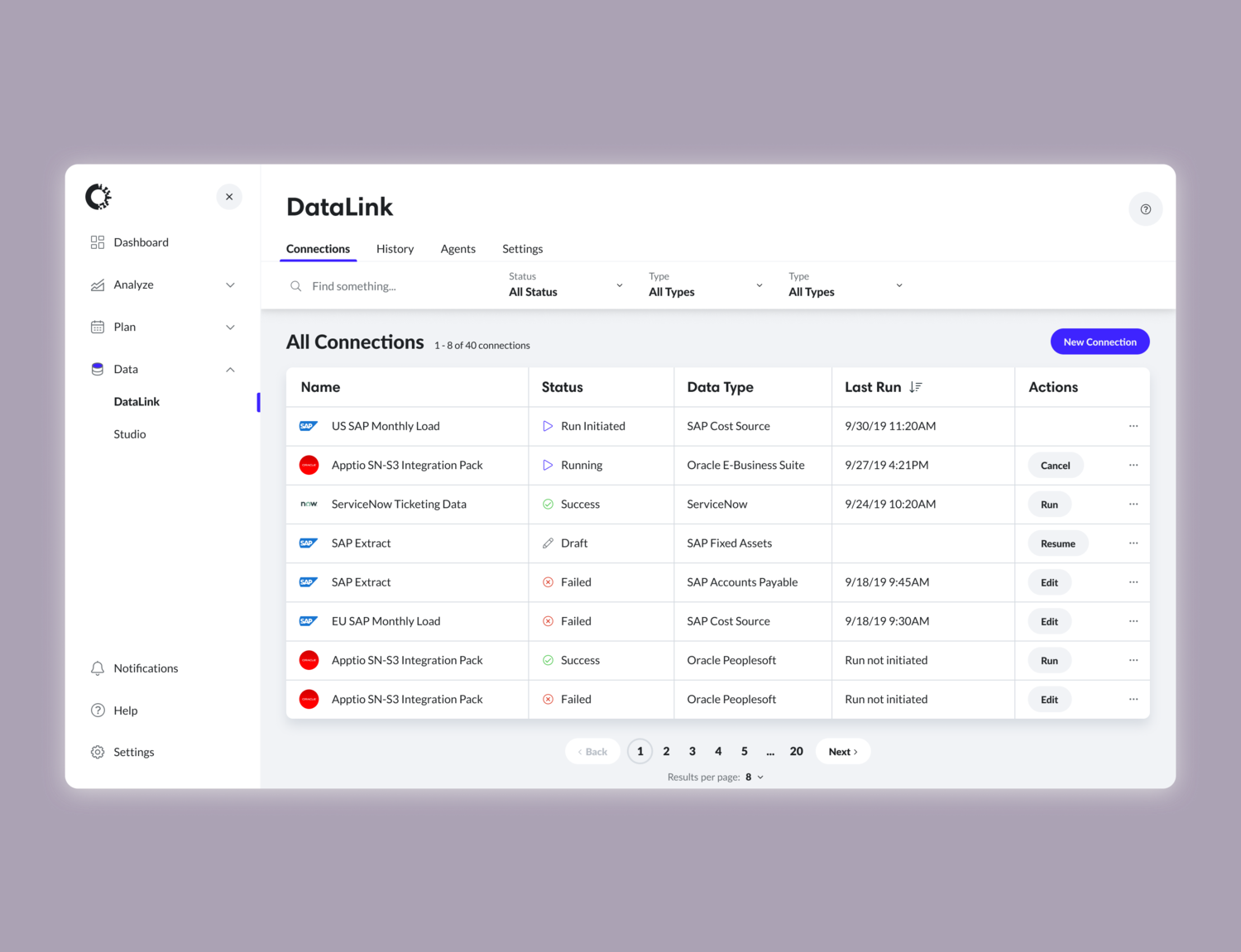
Main page - All connections
This is the landing page where users land to view, create, and manage connections.
I included more visual indicators such as logos and icons so that users can differentiate connections quicker and easier.
Keeping importance in mind, I changed column order and visibility of columns.
By providing filter, sort, search and pagination, I made it easier for users to find the connection they are looking for.
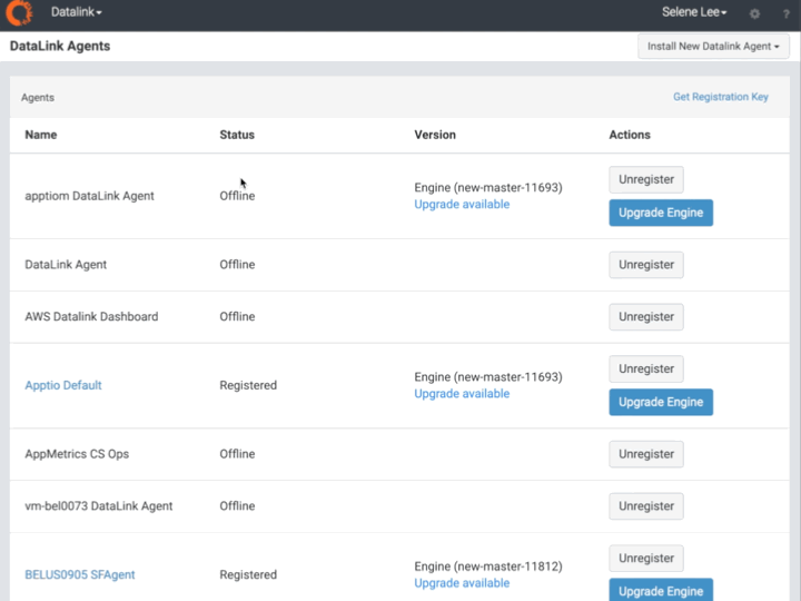
I changed the IA of DataLink by having four different sections in the app which are connections, history, agents, and settings.
In the existing product, users can’t find help when they need. By placing the help icon in the top header, I made it accessible to users on any place at any time.
I made ‘Create Connection’ as a primary action so that it’s easier for users to find where they can create a connection.
Existing datalink
Too much text makes it harder to quickly scan connection information.
New datalink design
By using more visual indicators, I made it much easier to distinguish different status of each connection. I also provided the ability to sort, filter and search the list.
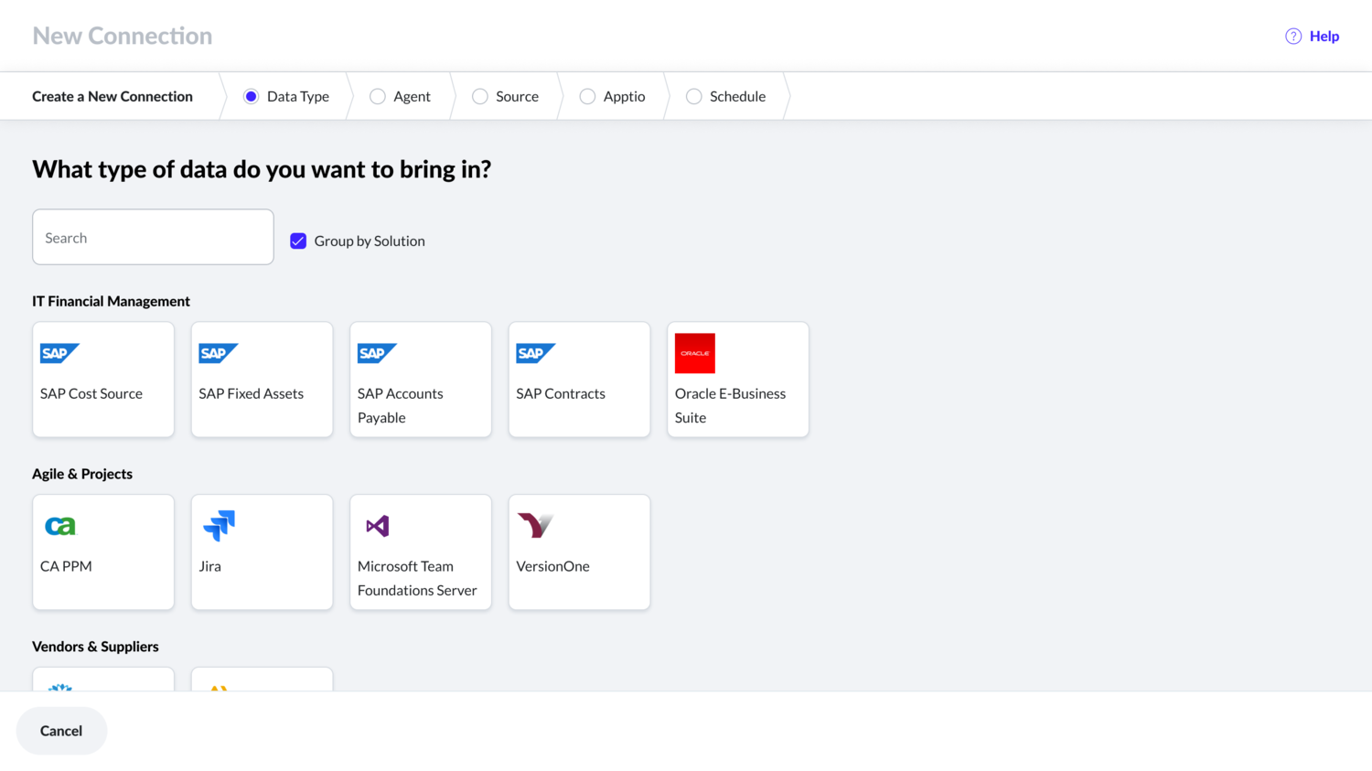
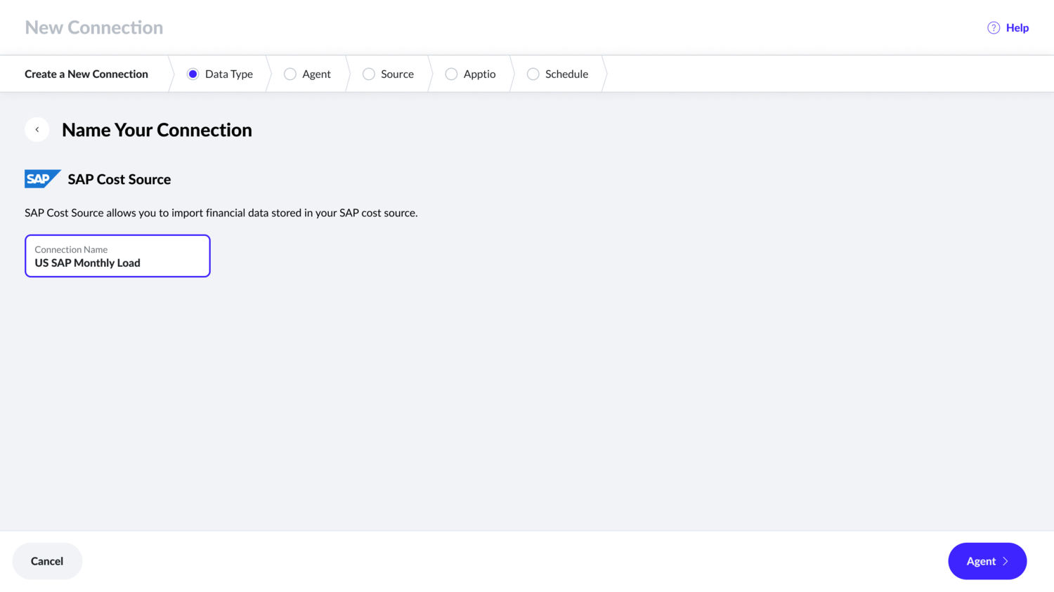
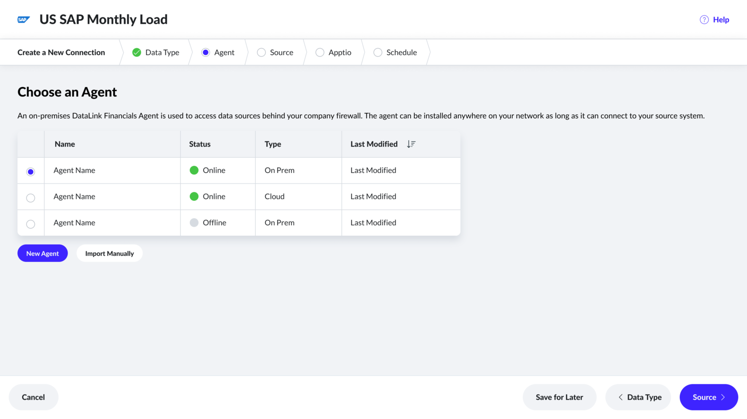
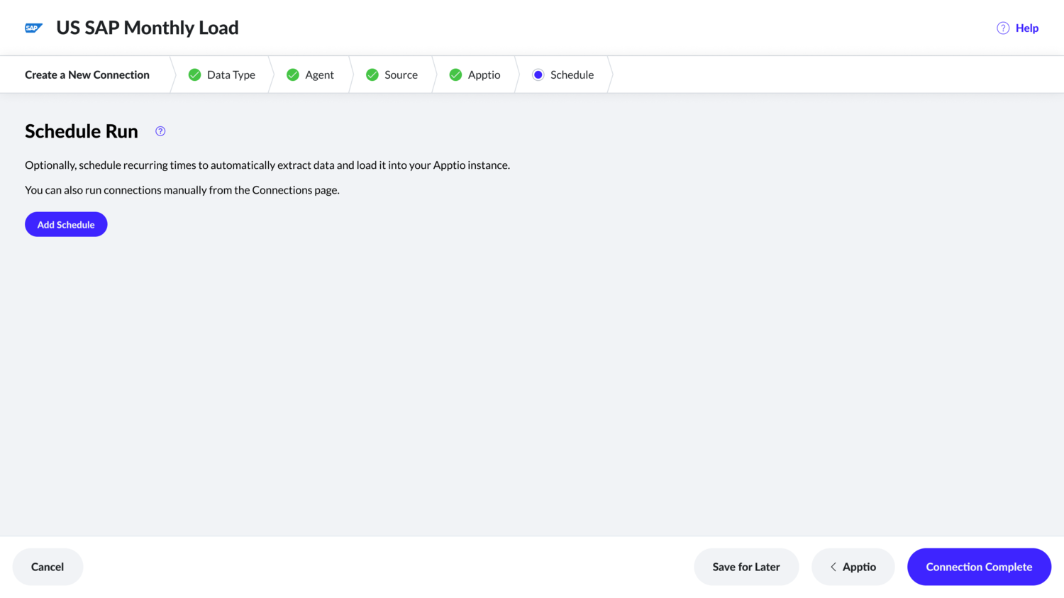
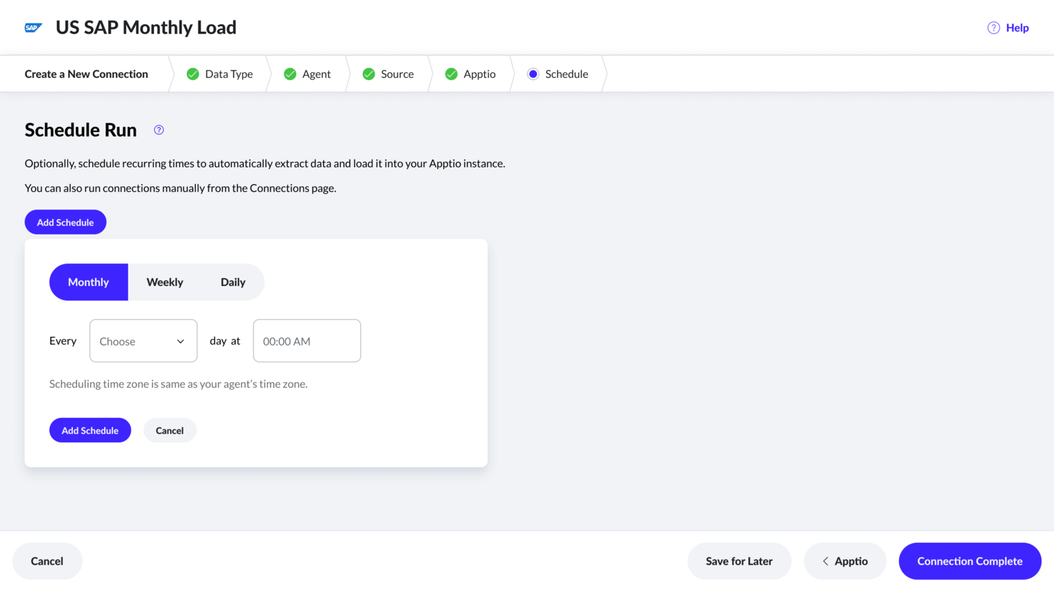
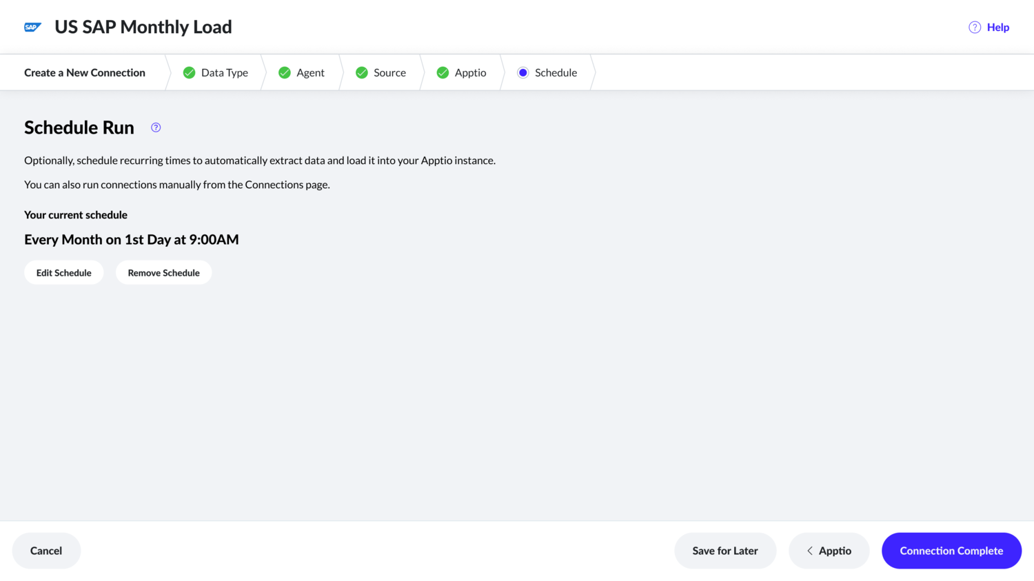
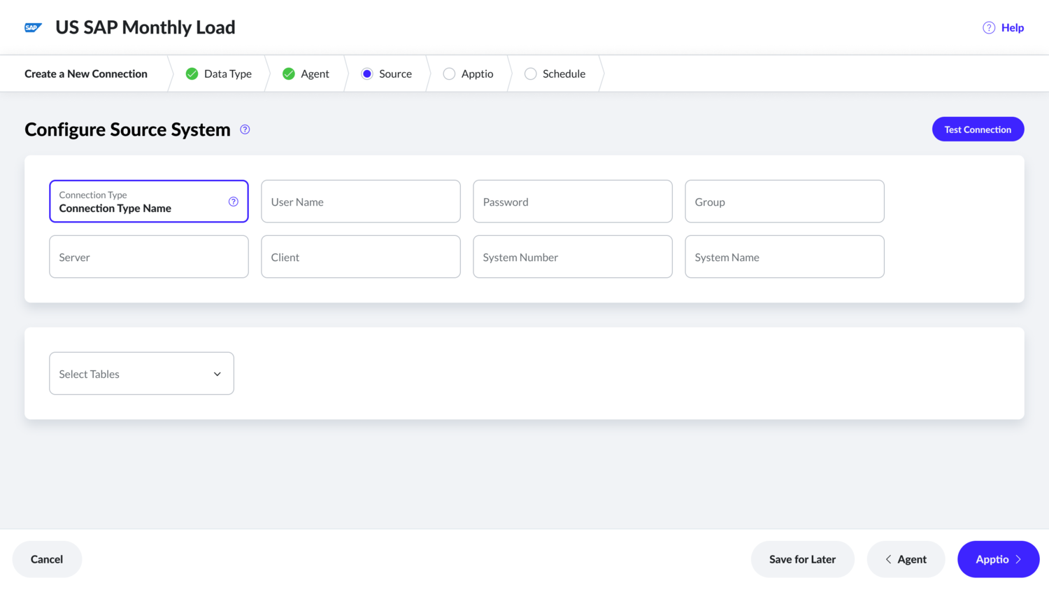
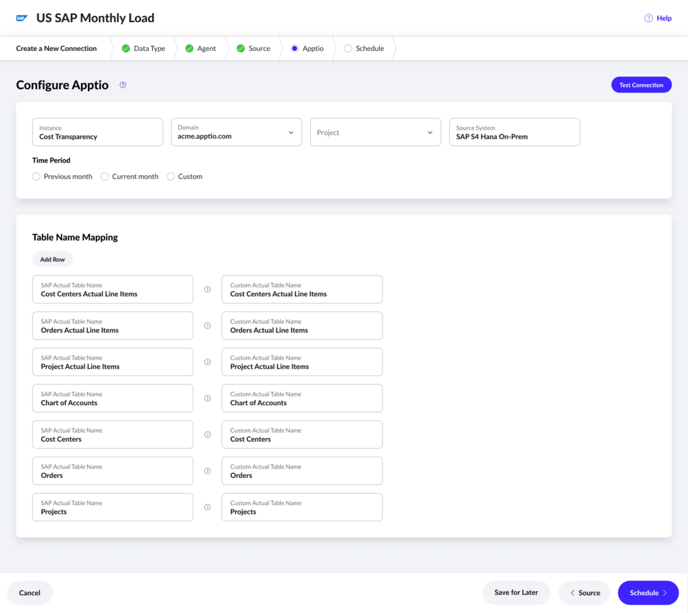
Step-by-step wizard
Existing product’s connection creation page has all fields on a single page that overwhelms users. Therefore, in this new wizard experience, I came up with five steps and each step aims to provide a couple of tasks along with appropriate help content.
Existing datalink
Too much text makes it harder to quickly scan connection information.
New datalink designs
Day 0 experience
As there will be many users who are not familiar with DataLink, I led the effort to introduce ‘day 0’ experience. In this experience, I am using empty space to educate users about they should expect. This way, they reduce to onboard to Apptio and get their values from Apptio reports sooner.